

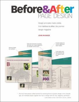
Before and After Page Design

Before and After magazine's focus on clarity and simplicity and its insistence on approaching design not as mere decoration but as an essential form of communication have won it legions of fans. If... This description may be from another edition of this product.
Format:Paperback
Language:English
ISBN:020179537X
ISBN13:9780201795370
Release Date:January 2003
Publisher:Peachpit Press
Length:208 Pages
Weight:0.90 lbs.
Dimensions:0.4" x 7.0" x 9.1"
Customer Reviews
5 ratings
New to design?
Published by Thriftbooks.com User , 17 years ago
This book is wonderful for designers new to design. It teaches you the basics rules and gives plenty of examples (before and after) of how to arrange elements and type. Very "eye catching" solutions! I am an illustrator & this is a wonderful way to enhance and round out my creativity in my illustrations. A definite must for someone new.
Not just Before and After...
Published by Thriftbooks.com User , 19 years ago
So many redesign books say "this is before" and "this is after." But this one has starts with how to design it and then shows a before and after to demonstrate. I like the callouts on why the each part of the layout was done and why it works so that it can be duplicated on my own. The designs also say when that layout should be used. For example, the digest-size newsletter says it's "great for short runs and small budgets" though the author says an example of this layout is Reader's Digest. I don't think of that magazine has having a short run or small budget. But yes, it is smaller. Some of the vocabulary is unknown to this new designer. For example, on a newsletter each area is explained but what is a kicker? What is a deckhead? He even says that the kicker box touches the edge, but doesn't say what it is. From the context of the layout, I guess it's the name of the magazine, but the kicker has a byline. So maybe not. There is a lot of great information on the different types of layout, but I'll jump forward to photo layouts since that's one of the things I am working on now. The before and after are dramatically different. And instead of just showing you the after, he shows how the layout came to be step-by-step. The progress photos are a great complement to the simplistic illustrations which I think are called wireframes. There are also tips a non-designer might not notice like overlaps add depth and a reminder to check for trapped space. I like all the random tips scattered throughout the book that aren't necessarily design, but a good designer probably would probabl know. For example, in the advertising section the author has a tip on taking a color photo. The brief instructions are illustrated with backdrop placement, angle of lights, and camera position. The book is great as a read or reference book. I can see myself referring to it for upcoming print projects. I will apply some of the design ideas to my web projects, though there isn't a web layout demonstrated. I wish there were.
Learning design
Published by Thriftbooks.com User , 20 years ago
We go at a frenzied pace to acquire and learn programs like Adobe PageMaker, Illustrator, InDesign, Corel Draw, Microsoft Publisher and applications of this type, namely those that are very much involved in `desktop publishing'. Once learned we then sit down and design a newsletter, flyer, brochure or whatever vehicle we pick to convey a message to an unsuspecting public. But, when you sit down and really think about it, who is the `unsuspecting' party? In my humble opinion it is I, the so-called designer of the material that we foist on that public out there.All too often, we forget, or really never realize that learning desktop publishing programs is but the first step. What we surely need after that is some training on the principles of good design. For those of you that have gone through extensive training in design schools, you know what I mean and can just go on to the book at hand for a concise primer on design. For those that have had no training in graphic design, listen up for your design skills are about to get much more extensive and sharpened.The book, Before & After Page Design, could not have a simpler or more descriptive title. The title says it all. The author takes a `before' design of some type and then, in the course of several pages, transforms that design into the `after' that leaves you saying, `Sure, why didn't I do that in the first place?". Granted, page design, like all art, is a subjective field, open to the whim and interpretation of the designer. However, I must admit that the initial designs presented (the `before') in many, if not most, cases would have represented my final efforts. But after seeing the transformation to the final (or `after') design, I must admit that it was not only more graphically stunning but totally logical.
Absolutely perfect
Published by Thriftbooks.com User , 20 years ago
I have read this book thoroughly and I love it. It's better than any book of it's kind, and I would recommend it absolutely. I do, in fact, whenever I get the chance.I own a bunch of books like this (including a couple by Robin Williams), but no other book is written (and presented!) so clearly. McWade is both a designer, making things look good, and a communicator, making things clear. He knows his stuff, but also knows how to make it accessible. And it's worked for me. I'm no professional graphic designer, but I was able to improve the look, and more importantly the usability, of all our corporate paper documents because of what I learned from this book. My partner is amazed (and very pleased). A very good $20 investment.Though I've been interested in design and typography for years, it wasn't until I read Before & After that I really felt I had the specific tools to make it work. He gives very specific advice and recommendations (point and pica sizes), but still gives you the confidence and know-how to deviate from his recommendations. Two nits: while everything is explained, not everything is explained in order. For instance, on page 11 he's telling me to use Century Light Condensed 16/18, but it's not until page 37 that I discover that the 16 is the font size and 18 is the leading. That only happens a couple of places, but it something he should have fixed.Secondly, a few of the examples were clearly written a decade ago and not updated. The principles are still completely valid (and very, very good). But the color scheme on page 160 was so 1980s it was distracting. Sad, since that was hands down the best (and most comprehensive) chapter in the book: "Create a do-it-all business portfolio." Buy it for that section alone.Seriously, no small business should exist without this book.
McWade Gathers all the Before & Afters in one BIG book
Published by Thriftbooks.com User , 20 years ago
In case you didn't get this, this book is built from years of newsletter and publication ( ads, flyers, business cards, etc) design in the mighty Before & After magazine.See: http://www.bamagazine.com/ for a taste and some free goodies.The design examinations here are thoughtful, well-reasoned and thorough from choosing colors to all-important voicing of typeography.This book is also much cheaper than buying all the back-issues of the magazine. The new design and format do a great job of presenting the designs.Jim, Before & After subscriber since issue one
Copyright © 2023 Thriftbooks.com Terms of Use | Privacy Policy | Do Not Sell/Share My Personal Information | Cookie Policy | Cookie Preferences | Accessibility Statement
ThriftBooks® and the ThriftBooks® logo are registered trademarks of Thrift Books Global, LLC
ThriftBooks® and the ThriftBooks® logo are registered trademarks of Thrift Books Global, LLC
