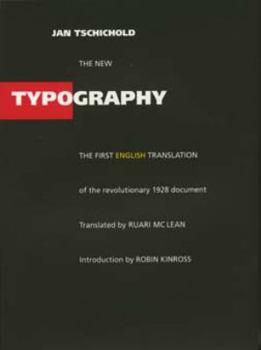
The New Typography
Select Format
Select Condition 
Book Overview
Since its initial publication in Berlin in 1928, Jan Tschichold's The New Typography has been recognized as the definitive treatise on book and graphic design in the machine age. At once a key... This description may be from another edition of this product.
Format:Paperback
Language:English
ISBN:0520071476
ISBN13:9780520071476
Release Date:November 1998
Publisher:University of California Press
Length:280 Pages
Weight:1.05 lbs.
Dimensions:0.7" x 5.8" x 8.3"
Customer Reviews
5 ratings
A founding document of modern history
Published by Thriftbooks.com User , 20 years ago
Typographic history, at least. This book was first published in 1928, and seems to have been the founding manifesto of the "Swiss school" of typography. This is a must-read for all serious students of type, and for a few others as well. First, the messages for typographers. The book itself is part of that message: sanserif body text, bright white paper, and geometric red and black graphics. Tschichold uses a few conventions that I quite like. Footnotes are indicated inline and at the end of the page by a heavy black mark. At first, it looked like a blot on the gray of the body type. After seeing it a few times, though, I realized that the heavy mark was very helpful for recovering my place in the reading after my eyes moved away to read the footnote. Emphasis is shown with heavy rules in the outer margins around text, much the way I mark books myself. My only complaint about the book as a whole has to do with indistinct paragraph breaks - there is clue from indentation or line spacing, so it is actually possible to miss a pragraph break altogether.The second half of the book shows a number of examples, good, bad, and (today) historically interesting. Almost all examples are bold red and black - the first two colors to be used up in most sets of crayons. It is easy to forget that these examples were often designed for letterpress, since photocompostion barely existed as we understand the term. Despite Tschichold's passion for modernity, the style now looks as dated as Bauhaus, streamlined locomotives, and Art Deco.The first half of the book is for typographers, but also for any modern student of polemic. Not many people have strong feelings about typography, so the ranting can be considered by itself. Tschichold's style is based on "the spirit of our age" somehow revealed to him alone, and on Germanic philosophical absolutes. It is ironic that, during the cultural purges of pre-WWII Germany, Tschichold was among those rounded up for politically incorrect artwork - another absolute in conflict with his own.Happily, Tschichold was able to emigrate to Switzerland before war broke out. He had a long and influential career, and later regretted the strident excesses of youth that this book captures. This is useful as a guide to typographic style, but beginners will probably get more from modern texts. It gives a very informative view of the DIN standards for paper and business correspondence. Most of all, however, it captures a time and a mentality that no longer exist, but that guided one strong school of typographic practice for over 80 years.
Impresionante estudio historico y psicologico
Published by Thriftbooks.com User , 23 years ago
Este libro introduce en el estudio de las nuevas tipografias que surgen a principio de siglo en Alemania. Si bien el traductor reconoce que el autor esta equivocado en algunas de sus apreciaciones (tengan en cuenta que se escribio a principios de siglo) no deja de ser una forma de comprender los cambios mentales que surgen de las tipografias, y como estas interactuan con la sociedad.
Get the Hardcover Version
Published by Thriftbooks.com User , 23 years ago
I don't want to repeat what others have already said, so here's a word of additional advice. Avoid the paperback copy and spend a few extra dollars on the hardcover version. Part of what made "The New Typography" what it was when it was printed was not only the contents inside, but the outside of the book as well. In sharp contrast to the classical title boxes on the spine of most books, 'The New Typography' was released in black cloth with silver / metallic ink on the spine, with the sans serif title reversed. Looks rather normal now, but imagine the response in the late 1920s. I have seen both the paperback version and the hardcover, and there's no comparison. If you want the total package, outside of finding a long lost copy of the first edition, get the hardcover. It's worth it, especially for purists.
A Manifesto for a Typographic Revolution
Published by Thriftbooks.com User , 23 years ago
Jan Tschichold wrote this book while still a young man, in reaction to the horrible typographic styles of the late 19th and early 20th century. As such, it is more an expression of a revolutionary spirit than a guide to good typography. The author himself rejected most of the ideas in the book a decade or so later. But it remains greatly influential, particularly in the field of graphic design for periodicals. Definitely worth reading, as a balance to the conventionality of most typographic books.
Perfect
Published by Thriftbooks.com User , 24 years ago
A great book about new styles in typography design..really helpful to broaden your point of view if you are interested in creation of an unexpected effect with simple fonts


