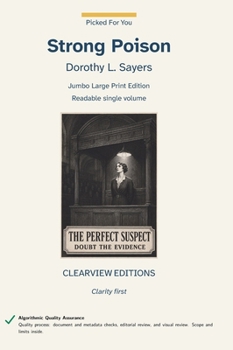
Strong Poison [Large Print]

Strong Poison by Dorothy L. Sayers. First published in 1930 during the Golden Age of British detective fiction, the novel introduced Harriet Vane into the Lord Peter Wimsey series. By making a detective novelist the victim of seemingly conclusive evidence drawn from her own research, Sayers turns an ingenious poison puzzle into a sharp examination of prejudice, trust, and sexual double standards. Harriet's intelligence and independence transformed the Wimsey novels, giving their dazzling detection a deeper emotional and moral dimension. The investigation turns on evidence, motive, and the credibility of a woman on trial.
This is a Jumbo Edition: it runs longer than our 442-page Liftable usability cap, printed in one volume up to our printer's mechanical maximum of 1,200 pages.
For collection development: this is a large-print edition intended for low-vision and aging patrons, and for any reader who finds standard trade print tiring over a long sitting. It suits large-print and accessibility collections, adult and young-adult general collections where the text is a standard, and reading-room copies where a durable case binding matters. This volume runs beyond the 442-page Liftable limit and is correspondingly heavier. The text is unabridged and reproduced from a public-domain source without modernisation.
Quality process: document and metadata checks, editorial review, and visual review. Scope and limits are explained in the book.
This Clearview Editions hardcover is built on a production standard that significantly exceeds the industry norm for large-print publishing. The body text is set at 18-point Atkinson Hyperlegible Next on 27-point leading, 1.5 line spacing --- the minimum WCAG 2.2 Level AAA Success Criterion 1.4.8 sets for a block of text, and the figure UKAAF's large-print guidance gives as well. The leading North American large-print hardcover imprints typically set their body text at 16 point, and most large-print trade paperbacks release at 14 to 16 point. At 18 point, Clearview Editions offers text that is measurably larger than every other major large-print publisher, specifically for readers with low vision, macular degeneration, glaucoma, diabetic retinopathy, or any visual condition that makes standard trade print frustrating or impossible to read for long stretches. The trim size is equally generous. Clearview Editions is printed on a 7x10-inch page, substantially larger than the 6x9 hardcover that is standard in the large-print industry and roughly 50 percent larger by area than the 5x8 trade paperback trim most legacy large-print paperback imprints use.
The extra page area is deliberate: it allows the 18-point body to set at the 50-to-55 character line length that reading-fatigue research identifies as optimal, without the narrow text columns and cramped margins that plague smaller-trim large-print books. The body font, Atkinson Hyperlegible Next, was developed by the Braille Institute of America specifically to maximize letter recognition for readers with low vision, macular degeneration, and visual processing differences. It distinguishes between commonly-confused letter pairs - lowercase l versus uppercase I, the digit 0 versus uppercase O, b versus d, p versus q - using distinctive shape features that preserve readability even under eye strain. Text is set ragged right with no word division: WCAG 2.2 1.4.8 and UKAAF both advise against justifying large-print text, since the uneven word spacing it creates is harder to track, and against breaking a word across a line ending, since the reader then has to reassemble it.
Customer Reviews
ThriftBooks ® and the ThriftBooks ® logo are registered trademarks of Thrift Books Global, LLC