


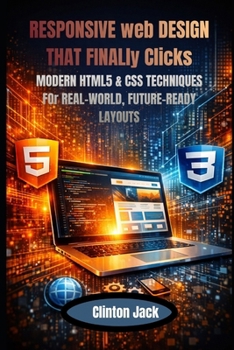
RESPONSIVE web DESIGN THAT FINALly Clicks: MODERN HTML5 & CSS TECHNIQUES FOr REAL-WORLD, FUTURE-READY LAYOUTS
No Customer Reviews

Book Description Modern websites are no longer judged by how they look on one screen, but by how well they adapt, perform, and remain usable everywhere. From mobile phones and tablets to ultra-wide monitors and emerging devices, responsive design has become a core professional skill-not an optional extra. This book was written to give you that skill in a way that is practical, future-proof, and grounded in real-world development. Responsive Web Design with HTML5 and CSS goes far beyond surface-level techniques. It teaches you how browsers actually interpret layout rules, how Flexbox and Grid work under the hood, and how to design systems that scale gracefully without relying on heavy frameworks. Instead of guessing, copying snippets, or fixing layouts through trial and error, you will learn to reason about layout behavior with confidence and precision. Inside this book, you will gain a deep understanding of modern responsive layout principles, including Flexbox, CSS Grid, adaptive media handling, responsive typography, motion that enhances usability, and performance-conscious design decisions. You will learn how to combine these tools effectively, avoid common pitfalls, and build complex layouts that remain stable across devices, screen sizes, and browser generations. Every concept is explained clearly, with practical insight drawn from real projects and professional workflows. This book is designed for developers and designers who want lasting skills, not short-term tricks. It shows you how to design layouts before writing CSS, how to debug issues quickly using browser DevTools, how to support older browsers without unnecessary complexity, and how to adopt new CSS features safely without breaking existing users' experiences. Accessibility, usability, and maintainability are treated as first-class concerns throughout. By the time you finish this book, you will no longer rely on guesswork. You will understand why layouts break, how to fix them without causing new problems, and how to decide when a layout is truly finished. Most importantly, you will develop layout intuition-the ability to anticipate behavior before writing code-allowing you to build responsive websites faster, cleaner, and with far greater confidence. This volume lays a strong foundation that prepares you for more advanced topics explored in future installments. Each chapter builds toward a mindset that separates professionals from hobbyists: designing for today without blocking tomorrow. If you want to build responsive websites that feel intentional, resilient, and ready for the future, this book gives you the understanding to do exactly that-and the confidence to keep going.
Format:Paperback
Language:English
ISBN:B0GL64DC3K
ISBN13:9798246628805
Release Date:February 2026
Publisher:Independently Published
Length:206 Pages
Weight:0.65 lbs.
Dimensions:0.4" x 6.1" x 9.2"
Customer Reviews
0 rating
Copyright © 2026 Thriftbooks.com
Terms of Use | Privacy Policy | Do Not Sell/Share My Personal Information | Cookie Policy | Cookie Preferences | Accessibility Statement
ThriftBooks ® and the ThriftBooks ® logo are registered trademarks of Thrift Books Global, LLC
ThriftBooks ® and the ThriftBooks ® logo are registered trademarks of Thrift Books Global, LLC