


All Formats & Editions
1 - 1 of 1 results found
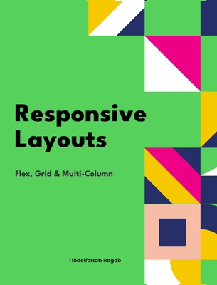
Responsive Layouts: Flex, Grid and Multi-Column
Edition Description
In this book, I will explain the three best-known responsive layouts: the flexbox, the grid and the multi-column layout. Flexbox is a one-dimensional layout that only works in one dimension at a time, either horizontally or vertically. The grid layout is a two-dimensional layout...
Edition Details
Format:Hardcover
Language:English
ISBN:B0D837MX72
Format: Hardcover
Condition:
$
48.80
Save $21.76!
List Price: $70.56
Copyright © 2026 Thriftbooks.com
Terms of Use | Privacy Policy | Do Not Sell/Share My Personal Information | Cookie Notice | Cookie Preferences | Accessibility Statement
ThriftBooks ® and the ThriftBooks ® logo are registered trademarks of Thrift Books Global, LLC
ThriftBooks ® and the ThriftBooks ® logo are registered trademarks of Thrift Books Global, LLC