


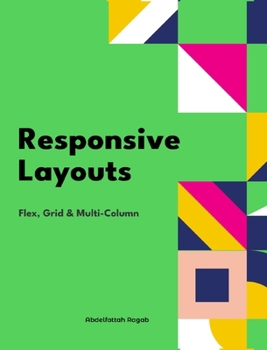
Responsive Layouts: Flex, Grid and Multi-Column
No Customer Reviews

In this book, I will explain the three best-known responsive layouts: the flexbox, the grid and the multi-column layout. Flexbox is a one-dimensional layout that only works in one dimension at a time, either horizontally or vertically. The grid layout is a two-dimensional layout that distributes the elements horizontally and vertically at the same time. The multi-column layout is a special layout for magazines and newspapers where the text should flow in columns with spacing, rules and so on. I'll explain all the properties and their values and how they affect the distribution of elements on the screen. Let's get started.
Format:Hardcover
Language:English
ISBN:B0D837MX72
ISBN13:9798331188887
Release Date:February 2026
Publisher:Blurb
Length:190 Pages
Weight:1.38 lbs.
Dimensions:0.5" x 8.0" x 10.0"
Customer Reviews
0 rating
Copyright © 2026 Thriftbooks.com
Terms of Use | Privacy Policy | Do Not Sell/Share My Personal Information | Cookie Notice | Cookie Preferences | Accessibility Statement
ThriftBooks ® and the ThriftBooks ® logo are registered trademarks of Thrift Books Global, LLC
ThriftBooks ® and the ThriftBooks ® logo are registered trademarks of Thrift Books Global, LLC