


All Formats & Editions
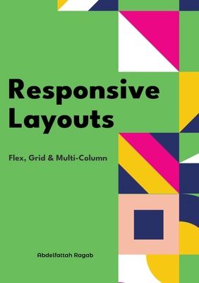
Responsive Layouts: Flex, Grid & Multi-Column
Welcome to the book "Responsive Layouts: Flex, Grid and Multi-Column" In this book I explain the three best-known responsive layouts: the Flexbox, the Grid and the Multi-Column layout. Flexbox is a one-dimensional layout that only works in one dimension at a time, either horizontally...
Responsive Layouts: Flex, Grid & Multi-Column
Welcome to the book "Responsive Layouts: Flex, Grid and Multi-Column" In this book I explain the three best-known responsive layouts: the Flexbox, the Grid and the Multi-Column layout. Flexbox is a one-dimensional layout that only works in one dimension at a time, either horizontally...
Responsive Layouts: Flex, Grid & Multi-Column
In this book, I will explain the three best-known responsive layouts: the flexbox, the grid and the multi-column layout. Flexbox is a one-dimensional layout that only works in one dimension at a time, either horizontally or vertically. The grid layout is a two-dimensional layout...
ThriftBooks ® and the ThriftBooks ® logo are registered trademarks of Thrift Books Global, LLC