

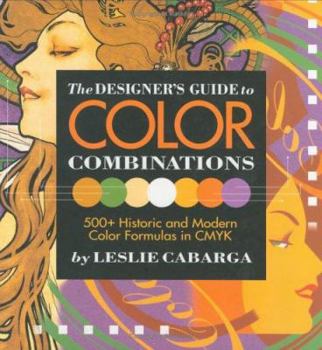
The Designeras Guide to Color Combinations


If you're from the "I don't know zip about color - but I know what I like" school of color theory, this book's for you. You won't find color wheels or lectures on color harmony here . . . just 500+... This description may be from another edition of this product.
Format:Hardcover
Language:English
ISBN:0891348573
ISBN13:9780891348573
Release Date:March 1999
Publisher:Adams Media Corporation
Length:144 Pages
Weight:1.65 lbs.
Dimensions:0.7" x 9.3" x 9.3"
Related Subjects
Arts, Music & Photography Design Graphic Design Illustration Techniques Use of ColorCustomer Reviews
4 ratings
Eyecandy of great inspirational and practical value.
Published by Thriftbooks.com User , 19 years ago
This is the first volume of two, the second being 'The Designer's Guide To Global Color Combinations. I own both and I regard them as simply unmissable, because I use as well for recreative as practical purposes.Each page offers a depiction of a work of art, which may be painting, illustration, texture, fabric. The main piece always has a short description (artist, origin, media) and a personal note by the author why the piece is so eyestriking.All pieces are catalogued according to time and style, so you'll find art deco, popart, contemporary, ... styles but also 'bad' use of color.However, this is NOT a book about color theory. The approach is subjective and you may find that your views differ with the author because the appreciation of coloruse is personal (which the author also underlines). Never the less this is also an outstanding objective guide to historical color use during the centuries starting from the late 19th century till now.For computer artists it also offers CMYK values, as well for the main piece, and variations on it.If there would be one negative point, it's only that there is not a cd added with all the palettes, so you would not have to type in the values. And, for people operating mainly in RGB color space, as the book cover states: no RGB values. (you'll find these in the second volume, but for some strange reason they were not added in this first volume).Despite this small point of criticism: this guide is a work of art unique in it's category. There is nothing that even comes close to the work of endurance the author has done, to offer the reader a practical and inspirational guide to color combining.A guide you'll browse and browse again.
If I'd ever lose it, I'd buy it again!
Published by Thriftbooks.com User , 22 years ago
This book fulfilled every expectation I had prior to its arrival, that is - it's not a color theory book in any way. It has no color wheels, nor does it theorize about complementary colors and the like. It's a collection of suggested color combinations - usually combinations which I'd never think of. And that's where the real value is!In the samples, you can easily notice which is the 'base' color and which colors 'match' in different situations. And each sample itself has some printed design-like feel, which makes it incredibly more usable than ordinary swatches in other books.Just by flipping the pages I found (color) suggestions for the designs I'm working at.Ah, and the book is also beautiful.If you're looking for color inspiration rather than theory, add this one to your basket!
This is the color book you've been waiting for!
Published by Thriftbooks.com User , 24 years ago
Sure there are plenty of books about color out there. Some are about color theory, some tend towards technical info about pre-press and separations, etc., and some even include swatches.I know -- I've wasted a lot of money on them over the years.This book, however, is unique, and the first one I've found truly useful -- even inspirational.Cabarga takes choice period artwork (from the Victorian era through ultra-modern rave posters), analyzes the colors, shows you why they work/don't work then actually pulls the colors out in CMYK-specified patches (w/numerical values) and supplies half a dozen or so examples of how to use each palette.This last feature is extremely useful: swatches without examples are virtually useless, and swatches without CMYK numerical values (or Pantone) can leave you guessing.Need a Victorian look? Want that 1950's Atomic feel? It's all here, and wrapped up in a breezy and humorous narrative that make the book a fun read as well as super informative.Highly recommended!
A lot of fun, and useful too
Published by Thriftbooks.com User , 24 years ago
I snapped up The Designer's Guide to Color Combinations as soon as I stumbled across it, and it has been the most useful and fun colour book I have purchased in years. What is unique about Cabarga's approach to colour is his understanding that our perception of how various colours work in combination is cultrally based, and changes over time. A colourful tile that might look fashionable in the late-19th century can look quaint or garish in the 1990s. Cabarga presents literally hundreds of historical colour combinations based on actual period designs. What makes this useful is that each design comes complete with CMYK codes which can be plugged directly into Photoshop, or converted (roughly) into HTML colour codes.It is no exageration to say that this book has opened me up to a world of colour combinations that I wouldn't have considered in the past. Great stuff.
Copyright © 2023 Thriftbooks.com Terms of Use | Privacy Policy | Do Not Sell/Share My Personal Information | Cookie Policy | Cookie Preferences | Accessibility Statement
ThriftBooks® and the ThriftBooks® logo are registered trademarks of Thrift Books Global, LLC
ThriftBooks® and the ThriftBooks® logo are registered trademarks of Thrift Books Global, LLC
